Rates of Change Of Parametrics
Let’s start with a little story. I was in sitting in math class, and my teacher introduced us to parametric equations. Basically parametric equations for our purposes have \(t\) as the independent variable, and \(x\) and \(y\) as dependent variables. You can then graph them to make graphs that functions could not make. Here is an example that will draw a circle:
\[x(t) = cos(t)\] \[y(t) = sin(t)\]Feel free to play with the slider below :)
Information Lost
Immediatly right after I learned parametrics, I saw that on a parametric graph there was some information being lost: the ‘slope’.
On a regular graph, you can see the slope at a point, but on a parametric graph, you can’t see the slope. For a normal function, slope is simple. It is \(\frac { \Delta y }{ \Delta x }\). On a parametric graph, what I call slope is \(\sqrt{ (\frac{ \Delta x }{ \Delta t }) ^2 + (\frac{ \Delta y }{ \Delta t }) ^2}\) The slope of the actual line on a parametric is \(\frac{ \Delta y }{ \Delta t }/\frac{ \Delta x }{ \Delta t }\). In contrast, my slope is basically the magnitude of a vector with the x component of the slope of \(x\) relative to \(t\) and the \(y\) component of the slope of \(y\) relative to \(t\). Let’s take a look at this visually.
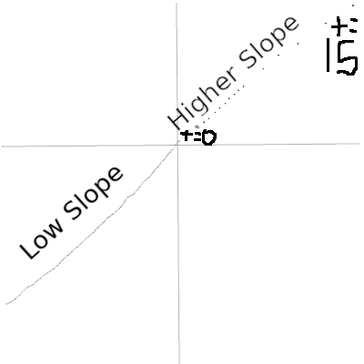
In the above image, all the points are from a \(\Delta t\) of 1, but some are spaced out more than others. This quality is what I call slope. When graphed continiously (all the spaces filled in), this information is lost. It just looks like a line.
Adding The Info Back
We can find the slope at an arbitrary \(t\) by using calculus!
\(\sqrt{ (\frac{ d x }{ d t }) ^2 + (\frac{ d y }{ d t }) ^2}\) basically gives us how far apart points would be spaced if we continued the parametric from \(t\).
So how do we represent this slope on a parametric graph? Colors
Let’s come up with an arbitrary example, and then graph it with color.
The functions:
\[x(t) = .25t^4 - 200\] \[y(t) = 50sin(t)\]and their derivatives:
\[x'(t) = t^3\] \[y'(t) = 50cos(t)\]We calculuate the color by \(\sqrt{ x'(t)^2 + y'(t)^2}\). Map this into a colorspace where red is low, and blue is high, and we can visualize this. This is the simple JavaScript for this:
for (let t = -2 * PI; t < s.value(); t += 0.1) {
  const slope = sqrt(Math.pow(yprime(t), 2) + Math.pow(xprime(t), 2));
  fill(slope, 255, 255);
  circle(x(t), y(t), 5);
}
Take a look at the below graph, both in the point spacing, and the color. When the points are closer together, we get red because the ‘slope’ is lower. Further apart, blue, because the slope, the distance, is higher. The distance between \(t\) is constant for all of the points (\(0.1\)).
I hope you learned something from this post, and feel free to look at the source code for the examples